
Tuesday, 16 December 2014
Monday, 15 December 2014


Task 9: DPS Construction PROGRESS 3
This is when I complete to add my Q&A, images and pull quotes. During this stage I decide to make my textboxes in a straight alignment so it'll looks neat and organised.

After I began to add page number, as real music magazine products always add page number and it is part of the elements for the code of convention of a magazine.

Then I began to add my magazine title on the corner of the magazine to reinforce the readers that they are reading TUNES magazine, this elements is also part of the code of conventions for a music magazine.

Task 8: DPS Construction PROGRESS 2
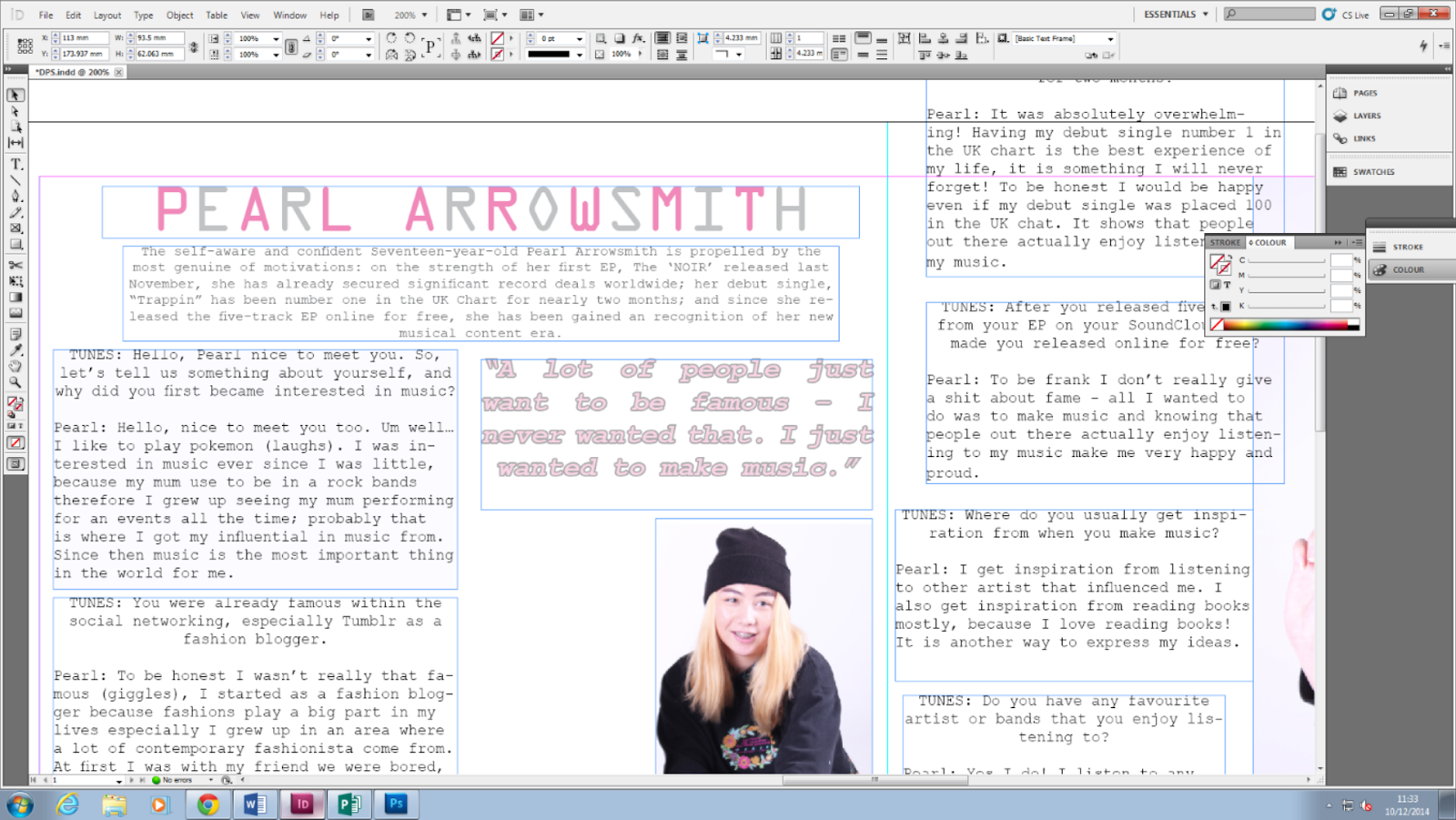
During this stage I became to add additional photography for the main cover star, in which I used photograph that I shot from the photography studio. I've decided to shrink the image as it was too big and having 1 page would not fit all my interviews Q&A.


After I began to add pull quotes as pull quotes are the main conventions for DPS. I used the pull quotes in another way to attract and grabs the audience attention, as pull quotes are the largest fonts in the DPS.
Sunday, 14 December 2014
Task 9: DPS Construction PROGRESS 1
Beginning of Constructing the DPS
This is the beginning stage of constructing my DPS. I used the image that I took from the studio, and for the masthead I used the same fonts style as the main cover lines in my front cover. I've also follow the main colour scheme which were grey, pink and white so my magazine would looks organised.


Then I began to start adding textboxes in which it contain the interviews for my main cover star, at first I added a brief on who my main cover star is so the readers can get to know some details on who she is.

Task 9: DPS Construction - INTERVIEW DRAFT
This is my draft for the main cover stars interview, in which this interview will be place on my DPS.

Task 9: Contents Page Construction PROGRESS 4
Last Stage of Construction for Contents Page
During the progress I thought my contents page was completed, however when I exported to JPEG most of my textboxes background became white instead it did not gave me a pink background.

So then I began to fill the background of the texts in pastel pink, while the fonts colours are in hot pink. The reason why I used pink is because it follow my colour scheme in general for my house styles, on the other hand the colour scheme I used for my front cover are grey, pink and white; as a relation it reflect and refer very well on how my front cover would looks like.


Finally, I've completed my content page and this is how it looks right now.

Task 9: Contents Page Construction PROGRESS 3
During this stage I was nearly done in completing my contents page, however I decided to add page number in the corner of the images so it could direct the pages number to the readers on what they want to read.


Lastly, I began to start adding social networking icon so the readers can follow my magazine for updates, and in relation it follow my distribution of a magazine in magazine proposal presentation.

Task 9: Contents Page Construction PROGRESS 2
During this stage I began to start adding picture for my contents page. Firstly, I added another picture that I took from the photo shoot of my main cover star so the heading can refer to my main cover star, in which it shows a relation.

Then I began adding images of picture that I took from my additional photography, so it can shows relation between the featuring article; therefore it'll give a hint on what it will features in my magazine inside.


Task 9: Contents Page Construction PROGRESS 1
Beginning of Constructing the Contents Page
This is the beginning stage of constructing my contents page. At first I start to change the fonts style in many different types of fonts style, this is because I wanted my magazine to be stylized and artistic. For the background I stick to the main house styles so it could refer back from how my front cover magazine would looks like.

Then I began to start adding textboxes in which it'll contain on what it would features on my magazine inside. Also I made spaces between the texts as it looks sophisticated and stylish at the same time, therefore it add a unique features for my magazine.

After, I began to add description for the main cover star model so it give the readers some details about my main cover stars, also it could be helpful for readers that do not know the main cover star and getting to know them for a bit.

And then I began to start adding sub-titles for the features heading, as I feel like it'll indicate the readers a start to know who their are and what they are recognised for.

Lastly, I began to add more headings and featuring article title in separate textboxes. I made heading and featuring article title the same as the previous textboxes, however these are just what going to be featuring inside my magazine. I added page numbers next to the heading so the readers will know what pages they need to flip through to read the article.

Overall, this is how my contents page looks right now.

Task 9: Front Cover Construction PROGRESS 4
Last Stage of Construction for Front Cover
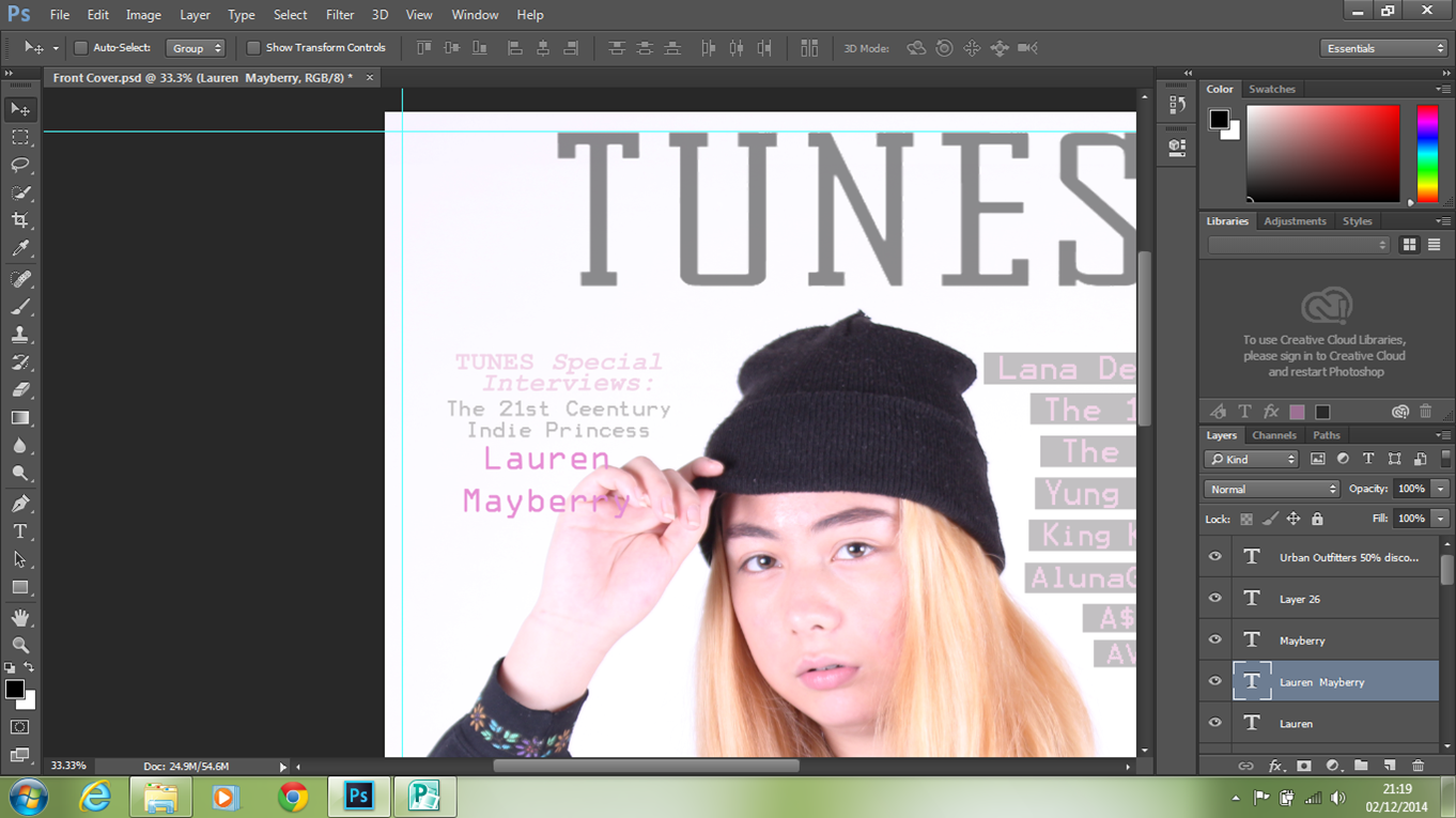
This is the last stage of constructing for my final magazine front cover. During this stage I began to add more sell lines since there was a lot of spaces, therefore I decided to add more sell lines so it'll fill in along with the alignment. For this sell line I've also decided to use the same fonts style as the main cover lines, since I've used 3 fonts style in which I want to keep it a minimum of 3 fonts style; as different fonts style can make the magazine looks too cluttered, therefore it'll make my magazine looks less proficient.

For this sell line I added 'Urban Outfitters' discount code, in which I made the '50% discount code' much bolder and I've added different colour as well so it contrasts along with the other sell lines fonts colour, it also follow my colour scheme as well which I find it very effective. The reason why I made the '50% discount code' bolder, so it'll grabs the reader attention more along with 'INSIDE' in capital letters which could refer that only this music magazine is giving out free discount code; therefore, it'll attracts the readers more, as the bold and capital letters is capturing their attention.

After, I've also added more sell line in which I made this sell line more stylized by adding gradient effects to the fonts. Since this sell line is about 'street fashion' in which it contrasts along the term of 'fashion', as the fonts looks very stylized and distinctive.

Lastly, I added barcode, dates and issues number since these 3 thing are the main convention of an magazine front cover. On the other hand, I've also placed a QR Code since we live in a generation where we use technology frequently, in relation it meet my distribution of a magazine in my magazine proposal.

Overall, this is how my magazine front cover looks and please do comment on what you like about it, and if there's any changes or improvement I should make... thanks :) !

Saturday, 6 December 2014
Task 9: Front Cover Construction PROGRESS 3
Today I began to add more sell line, despite I was going to only use 1 sell line. This is because many indie genre convention of magazine tend to often uses 1 sell line, but in my opinions I find that only 1 sell line in my magazine looks too plain, therefore there will be not enough information and eagerness for the readers. As a result I decided to add more sell lines so it'd bring eagerness to the readers.

During this stage I didn't know what fonts style to use for the 2nd main sell line, I wanted to use the same fonts style as the main cover lines.
However, it did not suit well with the other fonts style therefore, I changed to curly and italic fonts to emphasis the denotation of 'princess'. Since the curly italic fonts I used give off a feminine and girly feels, in which it suit well with the denotation.

Wednesday, 3 December 2014
Task 9: Front Cover Construction PROGRESS 2
I began to start adding cover lines, however the pink was too light therefore it kind of bleach in with the background in which it'd made it hard to read. I wanted to make the pink a bit darker, but it would not suit my magazine colour schemes; therefore I start adding square boxes behind the text, so the cover lines can be seen better and well easily to be read.


I was very pleased with the results of grey square boxes behind the texts, because it made the cover line look much easier to read. Also the colour scheme between the pink and grey really blend well.

Monday, 24 November 2014
Task 9: Front Cover Construction PROGRESS 1
Beginning of Construction for Front Cover
This is the beginning stage of construction for my front cover. I first removed the masthead design background since I print screen it from dafont, therefore it was not transparent so you could see the white background and border.
This was the masthead fonts style I am going to use for my front cover:

This is where I began to erase the white background so it become transparent.


And this was the results

After I decided to re-touch the photoshoot of the model, since she had some blemishes.
Before:

After:

This is where I finish the beginning stage of construction.

Sunday, 23 November 2014
Task 8: Additional Photography
Additional Photography
This week I went out to Brick Lane and Shoreditch High Street to take picture for my additional photography. The reason why I went to Brick Lane and Shoredith is because they are known for their contemporary culture, street fashion and many indie scenes come from there. This is why I thought Brick Lane and Shoreditch would be a great ideas for location settings, as it'll relate and it will be recognised by my target audience.
These are the locations where I was taking my picture:


And these are a example of photos which I've taken during the locations:


Overall, these images that are shown above I will be using them for my contents page as an additional photography. The reason why I've chosen these images is because they are very well linked with the concept of 'contemporary' culture in which it'll relate more towards my target audience. Also I find them very suitable for my features article on my contents page.
Subscribe to:
Posts (Atom)