Today I began to add more sell line, despite I was going to only use 1 sell line. This is because many indie genre convention of magazine tend to often uses 1 sell line, but in my opinions I find that only 1 sell line in my magazine looks too plain, therefore there will be not enough information and eagerness for the readers. As a result I decided to add more sell lines so it'd bring eagerness to the readers.

During this stage I didn't know what fonts style to use for the 2nd main sell line, I wanted to use the same fonts style as the main cover lines.
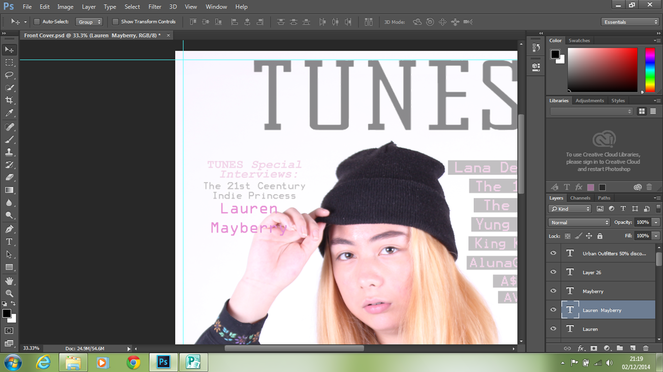
However, it did not suit well with the other fonts style therefore, I changed to curly and italic fonts to emphasis the denotation of 'princess'. Since the curly italic fonts I used give off a feminine and girly feels, in which it suit well with the denotation.

No comments:
Post a Comment